
Revamping brand for Figg (A Chase Company)
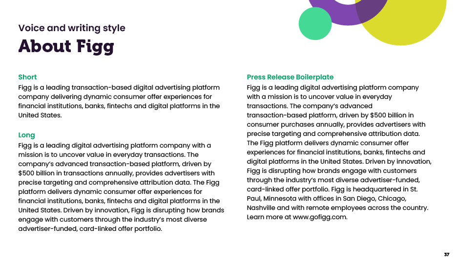
To enhance brand perception, establish consistency and visual governance, I took on the task of designing a comprehensive rebrand for the transaction-based marketing company, Figg. This case study delves into the strategic approach, design process, and outcomes achieved through the rebranding efforts.


Defining brand principles
We worked to establish brand principles that aligned with our mission. At first, we did research and learned key takeaways from other companies with brand/design principles like Spotify and Hulu. Then we met with company leaders and employees to truly create brand principles the company can get behind.
Color pallete created with WCAG 2.0 accessibility in mind
We defined 3 color Green is our dominate force. A representation of our publishers who sit between advertisers and consumers, embodying Figg's key stakeholders. Green should always be present.
Our purple is reserved for:
Advertisers
Call to actions
Moments of emphasis and action
Confetti
Our yellow is reserved for:
Consumers
Confetti
Connection highlights between publishers and advertisers
Our deep purple is reserved for:
Headlines
Subheads
Backgrounds
Outlined circles


Story through blending
Start to represent the story of how we enhance the experience for our three stakeholders using our photography and building blocks. When using an image with an advertiser, build up the interaction using advertiser purple, publisher green and consumer yellow building blocks.
In writing and in design, the rule of three states that elements arranged in a trio are more appealing, memorable and effective.
With Figg’s three colors representing our stakeholders, our brand drives that further by always having our confetti appear in multiples of threes.
Imagery mood

Our photography should represent authentic day-to-day interactions focusing on perspectives from our 3 stakeholders and our Figg team. Photography should inspire advertisers and publishers to see how they can connect to consumers. Photography should show consumers during moments of exchange. Whenever possible, use photography that is cut-out from the background. Find some here. You can use photography with a background but add brand confetti. Subjects should be engaging with their environment, not just posing in front of it. Don’t use obvious stock photography.
Key lifestyle categories:
Portray real, human-to-human interactions
Cover shopping moments that follow Figg offer categories
Highlight everyday life (family, pets, work, etc.)
Showcase all people (age, race, gender, sexual orientation, ability, class, body type, etc.)
Figg promo video

Under tight time constraints, I collaborated with Kyle Kehrwald from Snack Video to produce an animated promotional video that effectively communicated the Figg card-linking story. Taking charge of the storyboard and illustrations, I provided animation direction to Kyle, resulting in the rapid creation of an extraordinary video.
A comprehensive design process was implemented:
1
Research and analysis
Conducted an in-depth analysis of the target market, customer preferences, and industry trends to inform the rebranding strategy.
2
Visual Identity Development
Created a fresh and contemporary brand identity. Establishing governance in materials and branding.
3
Brand Positioning
Defined a unique brand positioning, differentiating the cash-back program from competitors, based on its key strengths and value proposition.
4
Communication and Collateral Design
Developed cohesive and persuasive communication materials, including branded emails, newsletters, and promotional assets, to effectively engage with partners.