Pax8 Figma design system
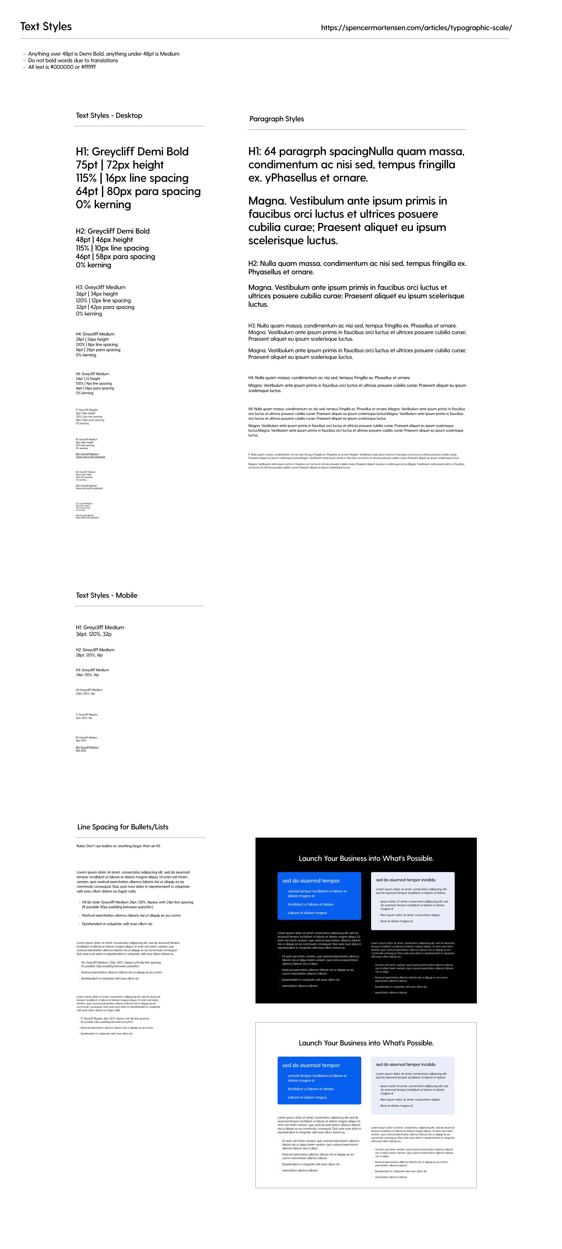
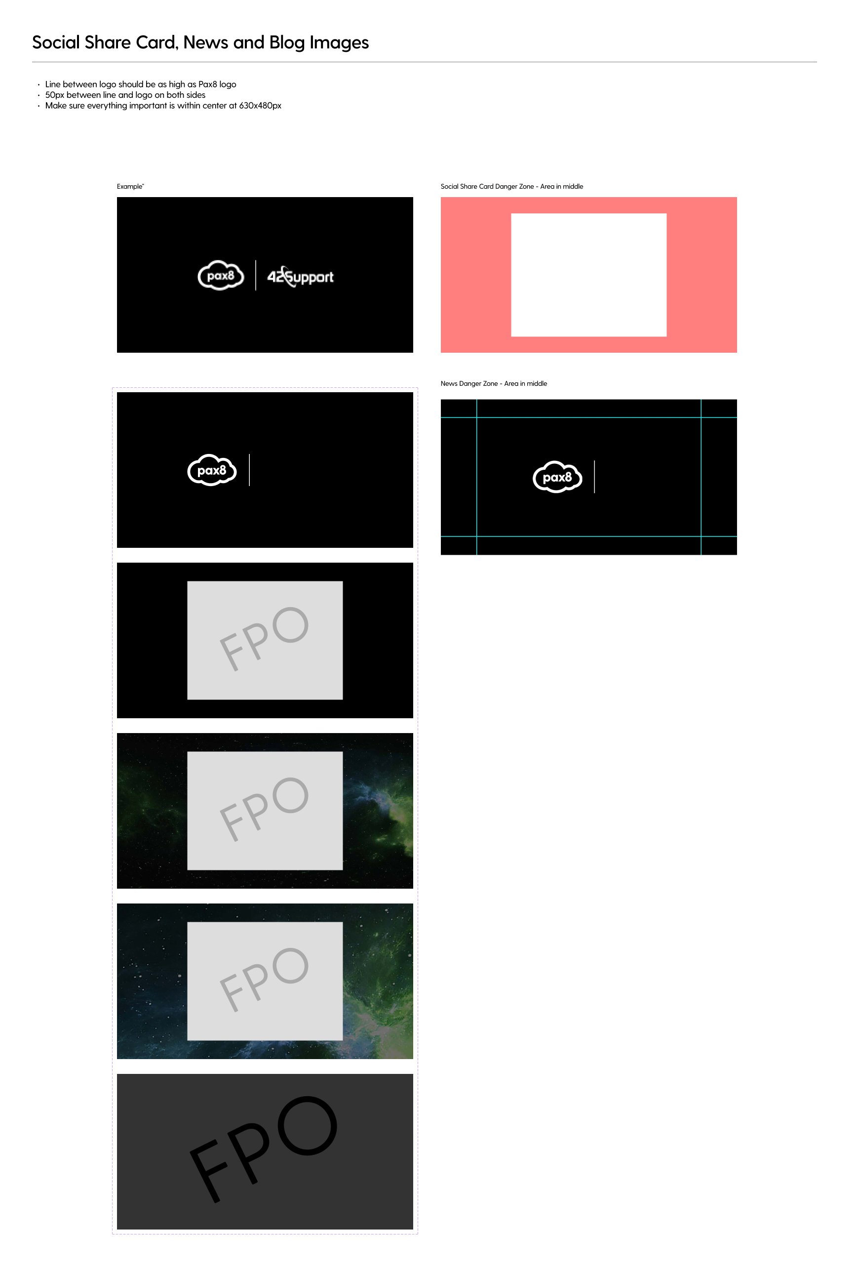
With my web understanding, I was entrusted with the task of establishing web standards, templates, and branding for the Pax8 website using Figma. This involved creating the Pax8 design system, which served as a comprehensive framework for maintaining consistent and cohesive design elements across the website and digital brand.
Color contrast and accessibility
Using WebAim’s contrast checker, I developed a color palette that was versatile and easy to use.
I found a tool that can check text size and color against photos used for accessibility using WCAG 2.0 AA standards.
I worked with the product team to create a cohesive color palette for both their use and ours.
Setting team up for success
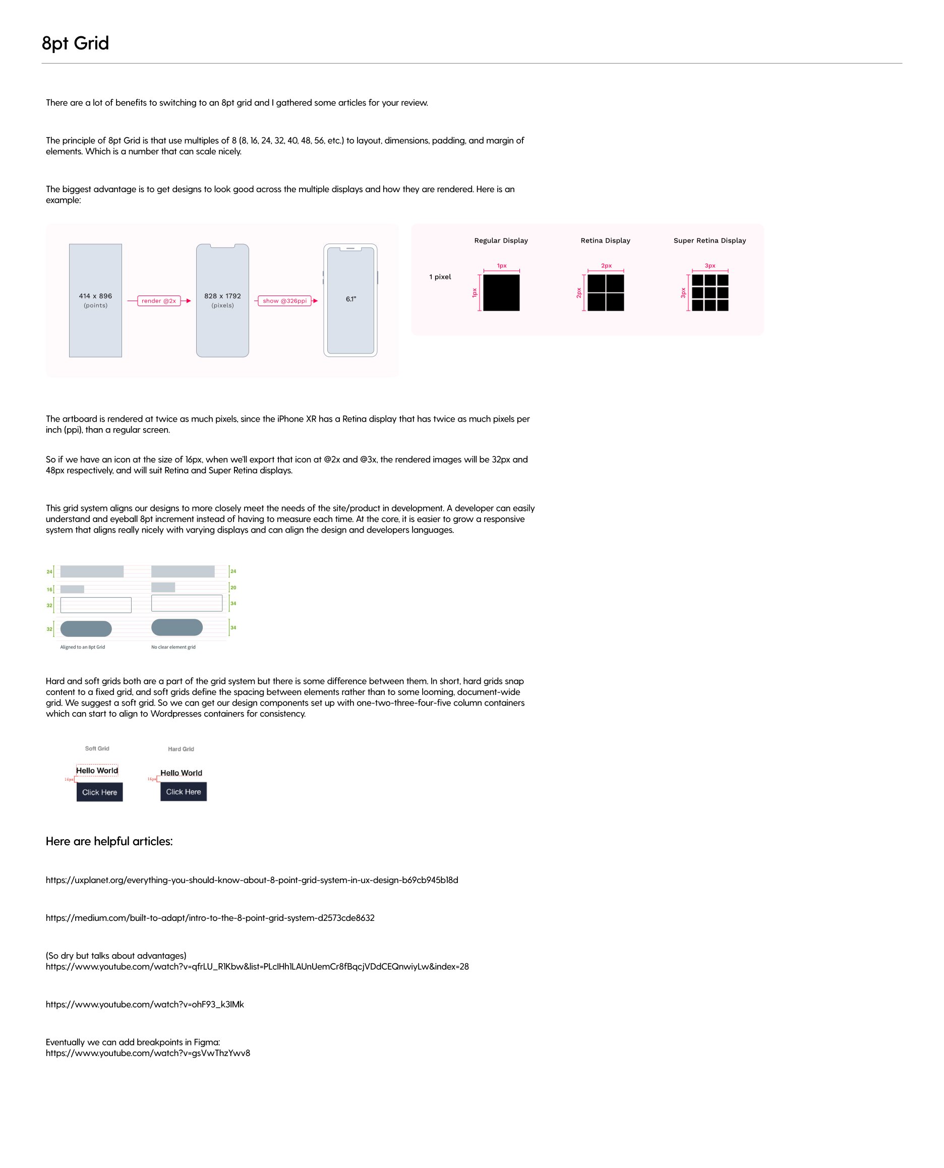
The design system has been aligned with an 8-point grid to ensure consistent and user-friendly design across its elements. Additionally, I implemented containers based on the principles of atomic design. At Pax8, WordPress was initially set up with a hard grid, so there is still some work ahead to integrate the soft grid system into the WordPress templates. However, incorporating is part of our plan moving forward.
Training that went along with the Design System
Along with the design system, I conducted training for the design team on how to use the Figma system and created a web style reference and templates for easy creation.


